- April 4, 2025
-
-
Loading

Loading

By David Haynes
Contributing Writer
Composition in photography tends to be talked about as a set of “rules” — how to place, arrange and depict the elements within the image. But it’s more helpful to think of a collection of techniques or tools to choose from when determining how best to photograph something.
And don’t restrict yourself to just one of these techniques - part of the fun is mixing and matching to make the most of an image — adding impact and interest!
Let’s take a look at a few examples:
1. Rule of Thirds. Imagine dividing the image like a tic-tac-toe grid — the strongest areas of interest are then placed on the lines or where the lines cross. But here, we’ve also used a shallow depth of field to throw the background out of focus — and color contrast. Her face is lit by a lightbulb behind an umbrella — setting the camera white balance to ‘tungsten’ is correct for her and makes the background daylight look very blue. The eye is drawn to warmer colors so this color contrast can be very effective.
2. Frame within a frame. Try using doors and windows to frame your subject within the frame of the photo. Here, the steel safety line running through the door helps to connect the foreground frame to the subject and beyond while the vertical ladder adds lines leading the eye up to the hatch in the roof.
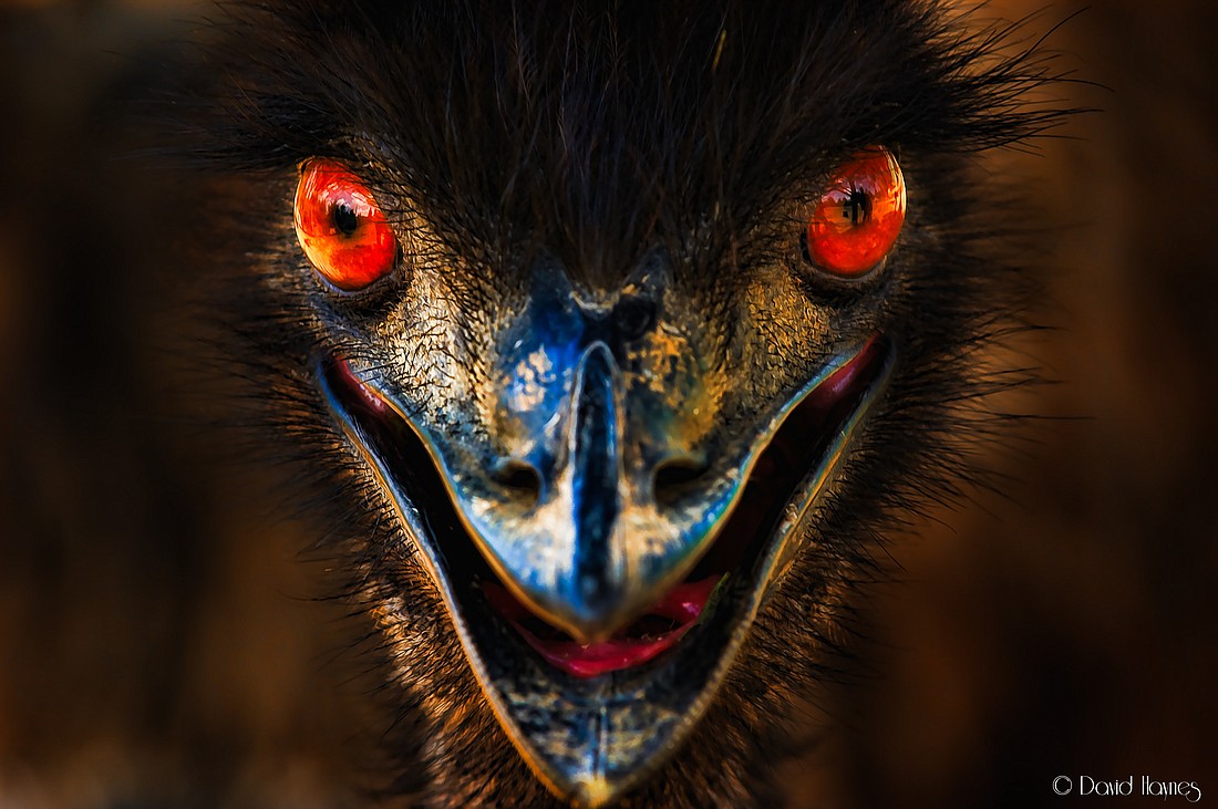
3. Fill the frame. For more impact — make your subject fill the image — either by zooming your lens or getting closer — or both! One of the most common mistakes for a photographer is to leave too much space around a subject when it isn’t needed.
This composition also uses symmetry — which can add real strength to an image — and a very shallow depth of field so only the eyes are in focus.
4. Leading Lines. Lines can add real impact to an image — the eye can’t help but be drawn along them. Using a super-wide angle lens adds perspective, drawing the eye along the length of the airplane to the horizon. Using symmetry works well for this subject — but chances are your eye is drawn initially to the open hatch in the top of the image — where the symmetry is broken.
David Haynes is a photographer and cinematographer who has traveled the world capturing iconic images for organizations such as National Geographic and the BBC. His work can be seen in magazines, newspapers, and book covers. His column appears monthly.