- December 13, 2025
-
-
Loading

Loading

Maitland’s new brand is coming together. Literally.
Planning and branding firm Arnett Muldrow & Associates revealed its marketing plan for Maitland last Thursday, with the tagline, “Come Together!”
The firm contracted with the city to provide a new image and brand for downtown Maitland and its west side. They hosted a week’s worth of workshops, focus groups, and meetings to come up with their vision, unveiling it to the City Council, city staff, and city residents on Thursday.
“What we’re doing is we’re adding a new tool to the tool box to help reengage and invite people to rediscover Maitland for themselves,” said Ben Muldrow, partner with Arnett Muldrow & Associates.
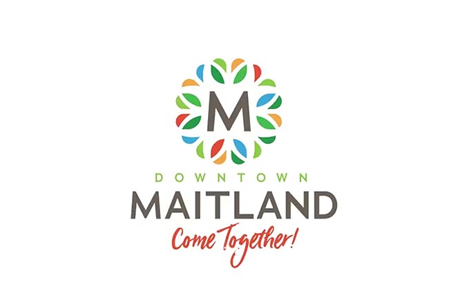
The new branding focuses on two new typefaces, with a fresh, clean and adaptable monogrammed “M” logo for downtown Maitland or “W” for the west side of Maitland. The color palette includes vibrant shades mostly of green, with orange, blue and red tied in.
Muldrow said the logo marries two of Maitland core tenants: trees and Mayan architecture. The tagline, “Come Together!,” he said, encapsulates what Maitlanders want their downtown to be: a centerpiece for the city where the community can gather.
“Amen!” said Mayor Dale McDonald when the final line of the branding statement was read.
“Personally what I was looking to see was something fresh, simple, adaptable and gives an entirely different look to Maitland from a public and pedestrian and a traffic standpoint…” McDonald said.
“Isn’t that what we’re really trying to do? To see this city – as fabulous as it is – differently, and let it be the cool city it can be, and sustainably so.”
West Maitland got its own tagline in the proposal, “Go West. Come Together.” As did the Downtown Maitland Partnership, “Making it Happen Together.” and Maitland Center, “Global Reach. Tree-Lined Streets.” The branding plan also floated redesigned logo ideas for the Maitland Area Chamber of Commerce, the Maitland Public Library, and the city’s annual events all incorporating the new logo’s style and typefaces.
The goal, Muldrow said, was to create a cohesive brand identity that could tie together the different assets of the city while also highlighting the different strengths of all its parts.
“Every single time your citizens see one of those variations, your overall brand earns more meaning and becomes more relevant to folks,” Muldrow said.
By doing so, he said, “You’re creating an identity system that helps you cut through the clutter.”
As the city works to redevelop its downtown, it also needs to revamp its image, Muldrow said. Many residents don’t even know where “downtown” Maitland is, Muldrow said, but by hanging signs and branding the area as downtown, it can create an interest and association with residents as they drive through.
“What we’re giving you with this downtown brand is a destination identity,” he said.
And once downtown is open for business, he said, hosting engaging, active events downtown will help bring about a positive relationship between the residents who attend and the city.
“We need our events to perform strategic functions,” Muldrow said. “We need regular, reoccurring, easy-to-pull-off events that help to teach people to come downtown.”
By having the branding in place, Muldrow said, the city and its public and private partners can take the new themes and implement them throughout all facets of the community.
“This process and the foundation that we’re trying to create is one that your community can take and run with,” he said.